Websites have mostly all been about color schemes, beautiful images, and layouts. But there might be something that you’re missing- the use of the right fonts to convey textual content. Now you might just be using some fancy font without understanding the science behind them. That’s why we’ve created this guide to help you understand how you need to use fonts on your site and how to mix and match different fonts on your site.
Before you go further you might want to see if you’ve got all these website elements on your site.
Table of Contents
1. Adding Visual Contrasts to Different kinds of Text
Take any website for instance and you’ll see that some textual content is styled differently. For eg CTA’s are bolder and more eye-catchy because they are the gateways to conversions. Important text that needs to be viewed easily by the user is always bolder and more contrasted than the rest of the content.
- Make sure there’s a marked contrast between two pieces of text. Say a heading followed by the body of the text- the heading needs to be bolder and convey an idea of the message below it. The user should be able t view this without missing it.
- Make sure you have a size difference between important pieces of text or text that should be first read by the user and the more insignificant content.
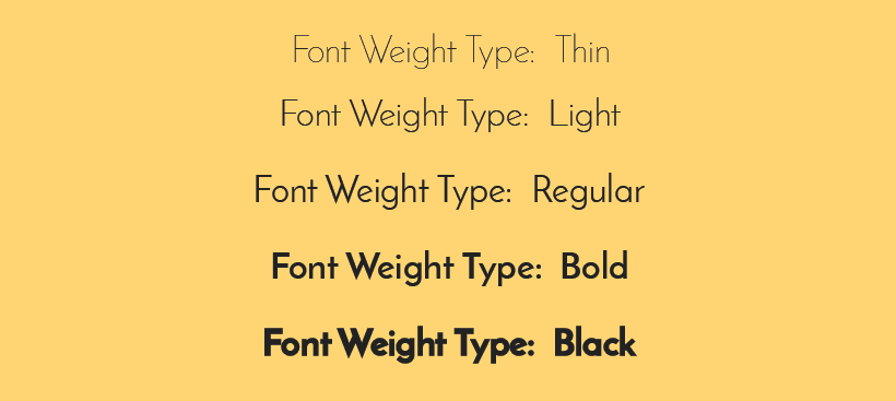
- Font weights and character spacing are also important. Font weights can create better contrasting effects and also help you emphasize more important text.
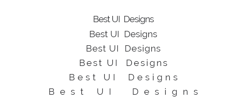
Font weights are i) Thin ii) Light iii) Regular iv) Bold v) Black. You should also check out how characters are spaced out and if it helps easy reading.
2. Choosing the Right Fonts for Headings and Body
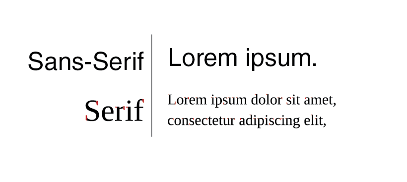
The common way to match heading and body texts in the right contrasting effects is to use ‘Sans Serif’ for headings and ‘Serif’ for the body from the same font family. For this article, I used Dejavu Sans Serif for the Heading and Dejavu Serif for the body.
- Using Serifs for the body makes the longer form of text more readable.
- But you need to choose the Sans and Serif fonts carefully. While Serif might be more readable in most font styles it can compromise on character spacing which makes a block of content a little hotch-potch looking.
3. Contrasting Fonts should have Similar Characteristics
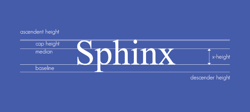
Each font style has its height. This is different from font size. The golden rule to mixing and matching your fonts is to choose fonts of the same height as shown below.
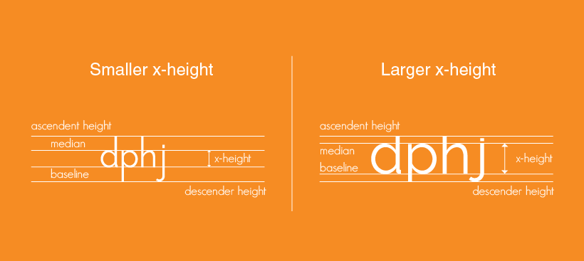
- Choosing fonts with higher x-height is good since it makes the text more readable and that’s a good thing. But when there’s an increase in x-height the ascenders and descenders automatically decrease.
This means you’ll have to resort to larger font sizes to make the text more legible. However, larger font sizes lead to more usage of space on your website. So you need to choose what kind of font gives you the right readability and height without too much space wastage.
Believe it or not, fonts convey emotions as well. Let’s say you’re starting a political blog on your site. Now, this is a portfolio of articles with serious content. So would it feel right to use Comic Sans as your font? No, and neither would it be good if you were to match Comic Sans with Times New Roman.

So opt for font combinations that give you the same serious or playful or emotional context.
4. Run Readability Tests on your Fonts
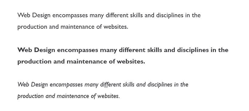
While you might have followed all these steps there’s still something you’ve forgotten. And you must test these different font contrasts in both their default, bold and italic forms. Remember a contrast that is good with let’s say Droid Sans and Droid Serif may not look as good with a body in Droid Serif Italics.
- So run enough readability on different font style combinations and if the same combination works well when the text is Bold or Italics.
You can access a lot of font and typography options that come with the templates you buy. Themeparrot themes like Runway for Business, and Shopy for WordPress, come integrated with Google Fonts so you can experiment with different fonts on your site.
Understand the font styles other websites are using. See how they’ve applied a mix and match to the fonts and if you find them readable. Typography is a science by itself and it plays a huge role in determining the way your users perceive your brand. So you just can’t afford to not pay attention to it.
Now you get some clarity about how to mix and match fonts on your website.
You might have outdated trends on your site. Read about outdated trends a lot of websites still follow.