With age, your website can go stale. A lot of website elements that were once considered the in-thing are now way past their expiry and need to be junked. Unfortunately, a lot of websites still keep these outdated website elements or trends on their websites. Now when you’re spending so much on maintaining your website you might as well make sure it’s following current trends.
Here’s a list of elements that are outdated and need to be scrapped from your website right away!
Table of Contents
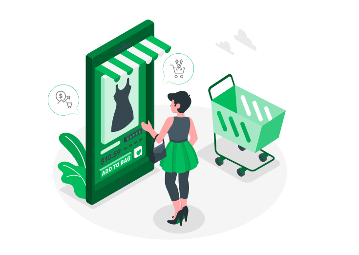
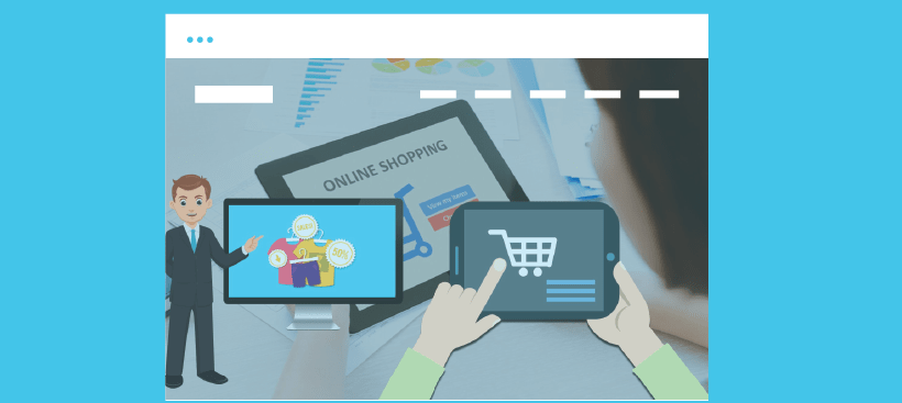
1. Stock Images
Those Overly Cheerful Images of Company Executives – Stock Images.
It’s high time websites get rid of generic stock images. They were at one point cool because they portrayed professional and modern company culture. But not anymore. Stock photos are one of the most cliched website elements that have been overused. Your visitors won’t see your company as a cut above the rest. You’re just another fish in the sea when they see generic stock images on your screen.
- Try hiring a professional photographer to get good images of your actual culture. Work with your marketers to spice them up so they portray what message you want to convey to your customers. You could use apt stock photos sparingly on certain pages of your site.
2. Different Fonts
Okay, the fonts are attractive. No doubt. But using every font in the world on your site is NOT attractive. You’re just confusing the user, trying too much. You’re also distracting them from actually reading and absorbing your content. Themeparrot WordPress themes come integrated with Google fonts.
- You have over 800 fonts to choose from. And you can choose two or max three different fonts that complement each other.
Check out Tori Avey’s blog. It’s a mixture of 3 different fonts that go well with each other. They’re simple to read stylishly and are not distracting.
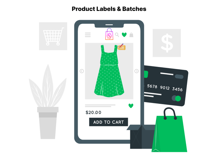
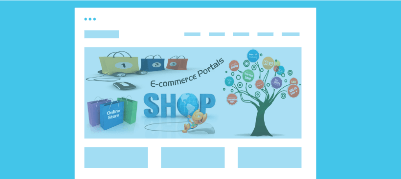
3. Glaring Images
Those Absolute Humongous Images Glaring on your Homepage.
We all go on and on about having an attractive homepage. How it’s supposed to be beautiful and hooks your visitor immediately. Nothing wrong with that but there’s something you’ve probably forgotten while you were busy looking for fantastic large images. Your homepage is the first chance you get to pitch your product/ service to your customer. So keeping large images is just going to get in the way of promoting your offer.
- Work out the right balance of image with important content. Going for a huge image that says nothing about what your business does for the user is just a waste of space and time. So get rid of all those huge banners and settle for medium-sized images that give you space to post important content right in the line of sight of the viewer.
4. Sign-up Boxes
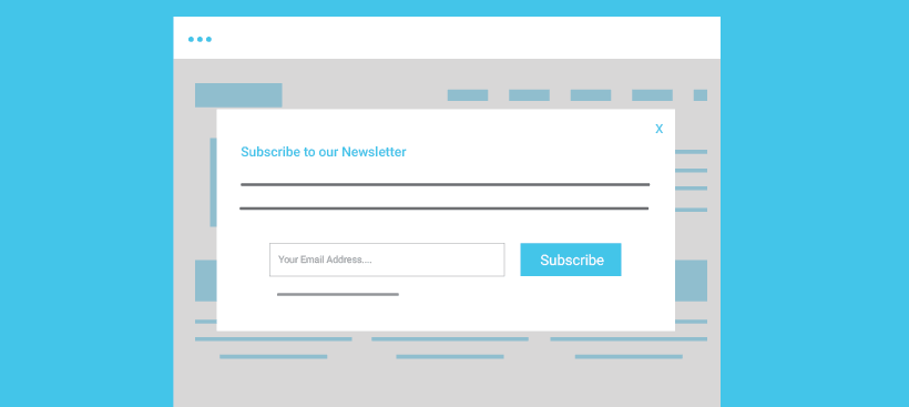
Those Sign-up boxes that drop out of the skies.
I know you’re trying to get customers to subscribe to your service so you can market to them, but sign-up boxes seem too much like a desperate way to get people to give you their emails. When a visitor decides to check your website for something he’s looking for he doesn’t want to be hindered by a signup box that tells him “sign up to read more”. He won’t. He’ll just move on.
- You can still let users view your content without dropping the sign-up box out of nowhere. Try to fit your signup box into a prominent place next to your content, so that customers who like what you have to offer will sign up immediately.
5. Overcrowded Tiled Content Display
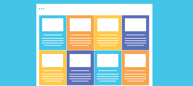
I like the tile style of displaying content made popular thanks to Pinterest. But some websites seem to overdo it by making their entire blog a slab of mosaic. Remember your website looks good when you have enough white space between your content.
- Tiles still look good but space them out. Don’t cramp them in. And don’t make every post a tiled piece of website content. You can reserve the tile style for new featured articles or articles that are popular with a lot of readers.
You should try out Score. Lots of white space with a clean modern design to display content.
6. Autoplay Videos
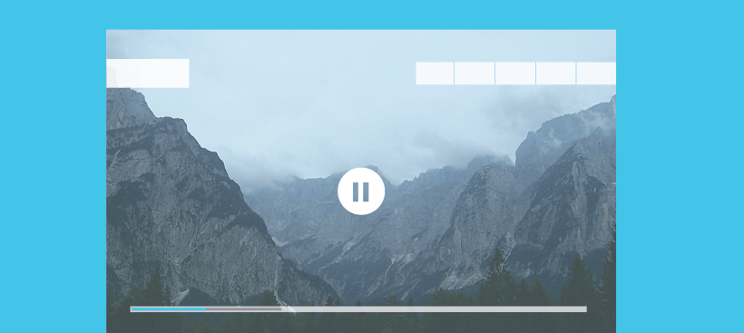
Those blaring videos play the moment users land on your pages.
Have you ever thought that a lot of people browse your site when they’re in a boring meeting or in a place that requires silence? Your users may not think of using earphones while browsing. That still doesn’t mean that you embarrass them by keeping videos that start playing the moment they land on your page. They’re not going to thank you for that.
- Scrap autoplay videos or anything that just starts blaring for no reason at all. You can post videos, particularly relevant ones, that your user can choose to hit the play button on. That’s his decision to make not yours.
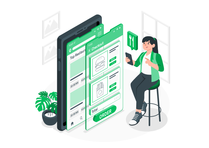
7. Mobile-Friendliness

When your website isn’t mobile-friendly, that’s embarrassing.
You’re probably shopping on your mobile too. And if you haven’t given your potential customers the ease of browsing your site on their mobiles, then that’s just sad. Everyone’s carrying their phones in their pockets and they need all the sites they browse to function properly on their mobiles as well.
- Make your website mobile friendly. Make it easy for your customers to navigate your site. The best thing about Themeparrot templates is that they’re totally mobile-friendly and come with great features that can be used on mobiles.
You should try out Runway for an eCommerce store or Verso if you want to set up a stylish corporate website.
So do you agree that these websites need to go right now? Do you know any other outdated website elements that need to scrap? Tell us!