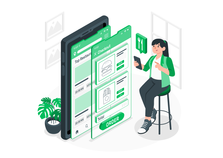
Having a website for your restaurant is indispensable in this digital era. Not only does it give potential customers a glimpse into your menu and atmosphere, but it also serves as a platform for online reservations and orders. However, it’s not enough to have a website—it must be mobile-friendly.
A mobile-friendly website for restaurants, especially a five-star restaurant like yours, is not only convenient for customers but also essential for the success of your business in today’s tech-savvy world.
Table of Contents
Tips to make a Restaurant Website Mobile-Friendly
Here are some ways to make your restaurant website mobile-friendly:
Use a Responsive Design
A responsive design is paramount when creating a restaurant website, especially when considering SEO for restaurants. A responsive design ensures the website adapts and scales seamlessly across various devices, including mobile phones and tablets. By implementing a responsive design, restaurants can cater to the increasing number of users who access websites through their mobile devices.
This provides a consistent user experience and is crucial in search engine optimization (SEO). Search engines like Google prioritize mobile-friendly websites in their rankings, making it essential for restaurants to optimize their online presence. With a responsive design, restaurant websites can attract more visitors, enhance user engagement, and improve their search engine visibility, increasing organic traffic and potential customers.
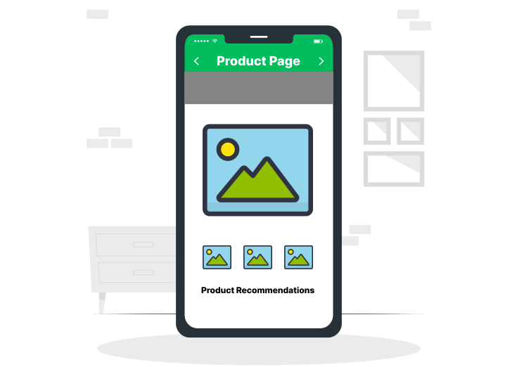
Optimize Images

Optimizing images is a crucial consideration when building a restaurant website, especially when focusing on local SEO for restaurants. Image optimization entails compressing and resizing images to diminish their file size while preserving quality. By optimizing images, restaurants can ensure their website loads swiftly and seamlessly on both desktop and mobile devices.
Websites that load quickly not only enhance user experience but also lead to better search engine rankings. Search engines value websites that deliver a seamless browsing experience; image optimization plays a significant role.
Additionally, optimizing images can also enhance the website’s local SEO performance. Restaurants can include relevant keywords in the alt tags and file names of their optimized images, helping search engines understand the context and relevance of the website’s content.
This can boost the website’s visibility in local search results and attract potential customers actively seeking local dining options. Therefore, by optimizing images, restaurants can enhance both the visual appeal of their website and its local SEO performance, ultimately driving more traffic and increasing their online visibility.
Simplify Navigation

Simplifying navigation is another crucial aspect when optimizing a restaurant website. Streamlining the navigation menu on the mobile version of the website ensures that users can quickly and effortlessly find the information they seek. The key is to create a user-friendly experience by using clear and concise labels that accurately represent each page or section of the website.
Additionally, incorporating a hamburger menu icon can provide a compact and visually pleasing navigation solution for mobile users. The hamburger icon, typically displayed as three horizontal lines, allows the menu to be tucked away and accessed with a simple tap, optimizing space and avoiding clutter on the screen.
By simplifying navigation, restaurants can enhance user satisfaction and reduce the chances of visitors becoming frustrated or overwhelmed while browsing the mobile website. This contributes to improved engagement, increased time spent on the website, and potentially higher conversion rates for reservations or orders.
Use Proper Buttons on Mobile Devices

Mobile users primarily interact with touchscreens, and small buttons can be difficult to tap accurately, resulting in frustration and a subpar user experience. By emphasizing larger and more prominent button sizes, restaurants can significantly enhance the usability and accessibility of their mobile website. With larger buttons, users can easily locate and tap them, reducing the likelihood of accidental clicks or missed interactions.
This approach contributes to a more intuitive and seamless browsing experience, enabling users to navigate the website effortlessly. Whether it’s a “Book Now” button for reservations or an “Order Online” button for food delivery, optimizing button sizes for mobile use is pivotal in driving user engagement and encouraging conversions.
By prioritizing large button sizes on the mobile version of their website, restaurants can create a user-friendly interface that effectively caters to the needs of their mobile audience, resulting in positive interactions and favorable outcomes.
Restaurant NAP for Better Visibility

Restaurant NAP (Name, Address, Phone Number) consistency is crucial for improving the visibility of a mobile-friendly restaurant website, especially in restaurant marketing. Ensuring that the NAP information is accurate and consistent across various online platforms and directories is vital for search engines and potential customers who access the website on their mobile devices.
Consistent NAP data builds trust and credibility, enabling a restaurant’s reputation to be a five-star restaurant. Customers can rely on NAP’s consistent NAP data to easily find and engage with restaurants, ensuring a seamless experience from the moment they search for dining options to the moment they step through the door of this renowned establishment.
This consistency also helps potential mobile device customers find accurate and up-to-date information about the restaurant, including its location, operating hours, and contact information. This is crucial for effective restaurant marketing in the mobile era. By maintaining a consistent NAP for mobile-friendly restaurant websites, restaurants can enhance their online visibility, attract more local customers who rely on smartphones, and strengthen their overall restaurant marketing efforts in the mobile landscape.
Conclusion
Having a mobile-friendly website for your restaurant is more important now than ever. With so many people using their smartphones to search for restaurants and order food online, a mobile-friendly website ensures that your restaurant is easily accessible to potential customers on the go. It makes it easier for customers to find your menu, hours of operation, and contact information, and it also gives them a better overall experience.
A mobile-friendly website can help you stand out and increase your restaurant’s visibility online. So if you haven’t already, it’s time to invest in a mobile-friendly website for your restaurant and give your customers the best possible online experience.


