Believe it or not, websites are a work of art. You pour in your creativity in designing it to not just look good but function well. When a visitor lands on your page, you’ll want him to stay for a while and scout around. Having a neat clean website that suits your brand will encourage more traffic. Let’s see how to make our website look nicer.
Table of Contents
Ample Whitespace
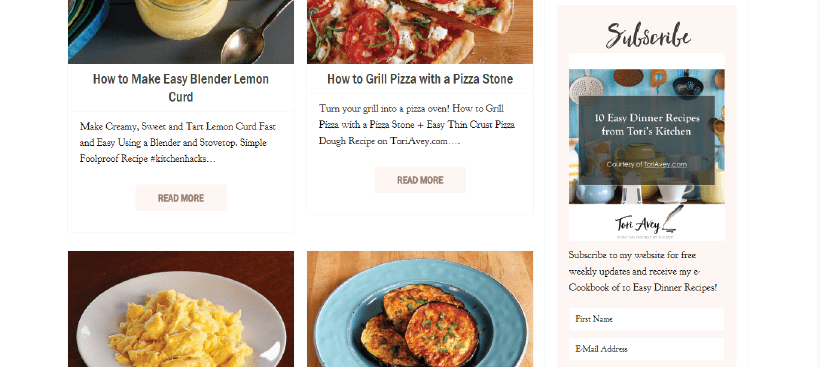
When I visit a website the first thing I notice is how cramped or spacious the website is. To me visiting a website is like visiting a physical store. When you meander around the store, you like to have some space. You don’t want to dash into things or feel overcrowded with too much stuff.
- The same can be said for a website. You need enough space between your element so that each element is focused on. Websites with a good amount of whitespace look more professional and classy. Most users out there don’t like clutter on websites because it’s distracting. So ensure that your website looks spacious and highlights your products.
Attractive Fonts
Attractive fonts are a great way to get visitors to read your content. So spend time choosing a font that suits your style. If you’re selling kids’ stuff in your store, you should try a more playful font in your store. Something along the lines of Comin Sans. It’s more attractive to kids and you’ll keep visitors flowing in. However, don’t opt for a script that’s hard to read. The last thing you want is your visitors squinting to read what you’re product is about.
Large Beautiful Background
One of the website backgrounds I loved was on Malted Barley. A restaurant that serves Beer and Goumet Pretzels. The moment you land on their page you’re treated to a visual display of yummy pretzels being made and frothy overflowing beer. The background makes it look appetizing and inviting.
- A beautiful background for your website will definitely keep people looking around your site for a while and they’ll be better chances of them converting. Set the color scheme to suit the tone of your brand.
Beautiful Color Schemes
Try and match different colors to give an edge to your site. I’ve seen tons of websites that have balanced professional colors with trendy ones beautifully. The trick is to not overdo it with too many colors. You can try a whole minimalistic color palette on your website and if you want it to stand to outmatch them properly with a solid bold color.
This website by Boris Novak looks extremely stylish. The website is a portfolio of paintings. Since a lot of the paintings are very colorful, they might clash too much with the website’s background if it has too much color on them. That’s why the entire website is matte white and grey so that the products are focused upon.
Wide Spaced Footers
Wide Spaced footers are trending right now. And it’s not just because they look good. Footers give you dedicated real estate on your site to display a lot of important information. It is no longer just there to act as a plate where copyright policies are served. You can incorporate links to important pages on your site, you think your customer will want to look at.
- It’s a great way to make navigation easy. Customers who already know your business and just want to see what your prices are can find the pricing table page in the footer. Candidates looking to be a part of your team can also find the careers page here. You can add links to support and FAQs since they are most frequently visited.
So now it’s over to you. Why don’t you try these out for your site and see if you love the way your website looks nicer now?
These tips to beautify your website can easily be implemented with Themeparrot templates. Check out the Template Store.


