A great user experience is known to be a surefire way to get more and more visitors to your site and engage with them. User Experience is more of experimental science than a perfect formula. You’ll have to mix up things, try different elements and check if they work in sync, and increase your conversion rate. That’s why we look to the A/B testing to see how two versions of the same website deliver improved conversions.
A/B testing is an important process you can’t afford to neglect. It gives you an insight into visitor behavior on your site and you can optimize your website better for the best results.
Here are some essential website elements you need to run the A/B testing on to see improved conversions.
Table of Contents
1. Run a Check on your CTAs
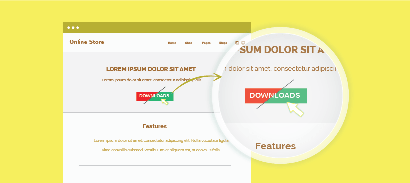
CTA’s are the first step customers take to engage with you. Download this free ebook, Get a free trial. The truth is just adding a CTA button will get you a small amount of traffic. Designing a CTA button is a science by itself. You can’t just put Download and expect people to click on it. You’ll have to prod them into doing it.
- Experiment with different colors and texts on your CTA buttons. Does Download Now see better results than Buy Now? Red CTAs are known to experience more clicks. Try out different fonts on the CTA text.
- And experiment with different locations for placing the CTA button on your site. Which page sees more clicks when the CTA is included in it? And where on the page does the button get clicked the most? These are some series of tests you need to run.
2. Content Checks
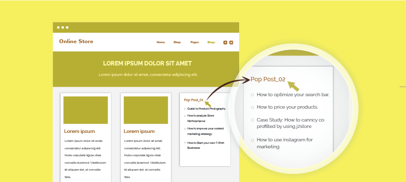
Obviously not all your blogs will experience the same levels of popularity. Some blogs will resonate and address the pain point of your readers which is why you’ll see a larger response to some forms of content than others.
- Experiment with the kinds of content you’re showing customers as well. Most websites have a popular posts category where good quality and relevant blog posts are displayed. Create two versions of this page with different popular posts. Check which web page version gives you better results.
3. Homepage Checks
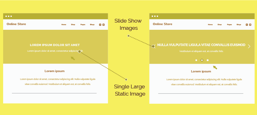
Homepages are the first pages of your site that your customer views. So it’s important to run a few tests on what kind of homepage keeps visitors for a long. Homepages set the impression that visitors have about your website.
- Try out different images for your website. They do affect how visitors react to your site. Check out a slide show of different products and offers work better at keeping visitors looking around. Or does a single large static image work better?
4. Run Tests on your Forms
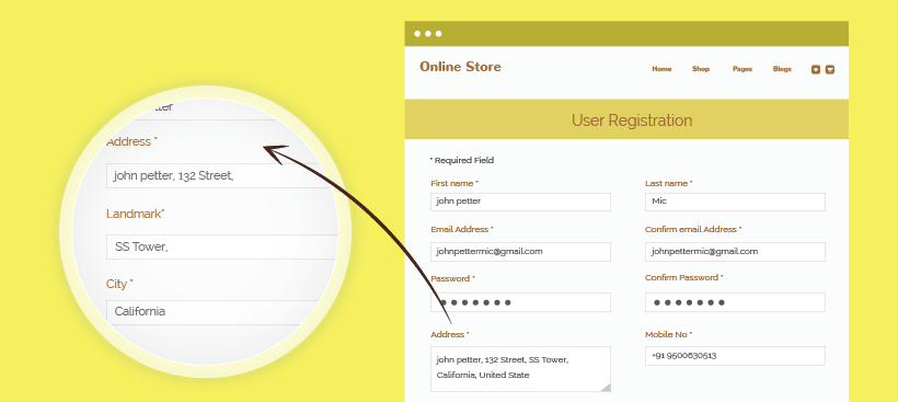
A visitor might like your product or service. No matter how much he likes it he’ll hate having to go through a long sign-up process. So another element to be taken care of is form optimization. If you’ve got long forms that the potential customer has to fill out, chances are he may back out.
- Try two different versions of the same form. Try a concise form without too many questions. Take the address bar for eg. You can give customers a blank space for the address field for them to enter an address. Or you can create different fields like ‘House No.’, ‘Street Name’, ‘District’ or ‘Landmark’.
- Customers generally prefer shorter concise forms that don’t have too many questions. Customers normally take one look at a long-form and don’t sign up.
5. Check Landing Page Performance
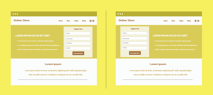
This is the most commonly used A/B testing element. Landing pages can make or break your sales and engagement strategy. So it’s important how every element on your landing page affects conversions. Also, tricks that have worked for one landing page on a site may not work successfully for the landing page of another site. So you’ll have to get your hands dirty and experiment.
- Play around with where to locate your CTA button. How many images should be there on your landing page? Try different regions on the page to display your content and the benefits of your service. Also, see where to place your sign-up form and which arrangement yields the best results.
6. Test the Effectiveness of Testimonials
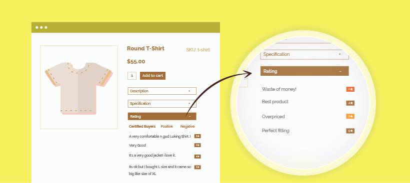
Everyone recommends keeping good testimonials on your website. After all, testimonials are proof that your clients are appreciative of your products or services.
- Section out a special place on your web page to display customer testimonials. You can try two versions. If you’ve got good reviews you might also have reviews on how you can better your service. One version display only good reviews. On the other version try out a mixture of both good reviews and reviews that say you need to improve. Now you can measure which page sees more customer engagement.
A/B tests can yield some surprising results. Like we said delivering a great user experience doesn’t go by formula. A common success trick that’s worked for many might damage your sales. Whereas lesser-known strategies have sent the sales of some businesses through the roof. So you must run live tests on your website to see what works well.
Tell us if you think there are other essential elements you’ve run tests on and seen surprising results. You can check out Themeparrot templates that are extremely customizable and make it easy for you to deliver a good user experience.

