In the fast-paced world of online selling, WooCommerce product pages act as your store’s online display window. It is where potential customers quickly decide whether to explore further or move on to something else. These digital entry points are vital for drawing people in and keeping them interested in what you offer.
According to a study by Baymard Institute, the average cart abandonment rate is a whopping 70%. But don’t despair! In this guide, we’ve clarified the wisdom from countless successful online stores into ten actionable tips that will turn your WooCommerce product pages into sales magnets.
Whether you’re an Ecommerce store owner, a businessperson seeking to bolster your online presence, or someone keen on enhancing online shopping experiences, you’re in the right place.
So, let’s embark on the journey of creating WooCommerce product pages that grab your audience’s attention, build trust, and propel your business forward.
Table of Contents
1. High-Quality Product Images
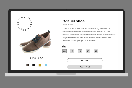
When it comes to your WooCommerce product pages, the saying “a picture is worth a thousand words” couldn’t be more accurate. High-quality product images are the cornerstone of an engaging shopping experience. They provide potential customers with a virtual touch-and-feel of your products, helping them make informed buying decisions.

Why High-Quality Images Matters
- Visual Appeal: Clear, sharp, and aesthetically pleasing images capture customers’ attention. Invest in professional photography, or use high-resolution images to ensure your products look their best.
- Transparency: Customers want to see exactly what they’re buying. Multiple product images showcasing your items from various angles. It helps eliminate doubts and build trust.
- Zoom Functionality: Enable customers to zoom in on product details. It allows them to inspect the quality and craftsmanship, fostering confidence in their purchase.
- Mobile Optimization: As more people shop on mobile devices, ensure your images adjust well to all screen sizes and look fantastic.
Compelling product images set the stage for an exceptional shopping journey. They create an immediate visual connection between your customers and your products, enticing them to explore further and make a purchase.
2. Custom (Extra) Product Options
Using custom product options is a powerful way to enhance your product listings and provide customers with more choices Shoppers appreciate the ability to tailor their purchases to their unique preferences and needs. It is where custom product options shine. They empower your customers to personalize their shopping experience, creating a sense of ownership and connection with your products.
With the Extra Product Options (Custom Addons) for WooCommerce, you have a reliable solution at your fingertips.

How Extra Product Options (Custom Addons) for WooCommerce Enhances Product Pages
- Customizable Product Options: Modify, add, delete, rearrange, and customize custom WooCommerce product options. You have full control over how your product options are presented. Make a product option (field) required or not, reposition the custom product options, and even add date & time pickers, file uploading options, or custom price fields to your products.
- 19+ Custom Product Fields: The plugin provides nineteen extra custom WooCommerce product fields for you. These fields open up endless possibilities for tailoring your product listings.
- Dynamic Fields / Conditional Logic: Based on the conditions you give, the custom product fields are displayed. It means you can show or hide specific options based on customer choices, simplifying the selection process.
- Set Price Options: Specify values in price and percentage based on the options and price rates. It is a game-changer for offering different pricing tiers or add-on options.
- Custom Product Forms / Sections: Group related product fields to create a custom product section or form. It helps organize product options and ensures a user-friendly shopping experience.
- Easy Section Positioning: Position product sections anywhere on your WooCommerce product page, ensuring they are presented exactly where you want them.
- Hidden Input: Hide the field data from customers and make it visible only to the backend (owners). It is useful for collecting information without overwhelming customers.
- Drag & Drop Form Builder: The simple drag-and-drop form allows you to effortlessly customize your product options. No coding skills are required.
- WPML Compatibility: Users can work with their preferred languages thanks to WPML compatibility. It broadens your reach to a global audience.
By integrating custom product options with the help of the Extra Product Options (Custom Addons) for WooCommerce, you not only enhance your product listings but also unlock new opportunities to cater to your customers’ diverse needs and preferences. Let’s give a try at its Free Version to learn about it.
3. Simple and Attractive Product Titles
Product titles are like the headlines of your online store. They’re the first things shoppers see, so they need to be clear and interesting.

Why Simple and Attractive Titles matters
- Quick Understanding: Shoppers should instantly know what the product is just by reading its title. Simple words make this easy.
- Sparking Interest: A good title should make shoppers curious and want to learn more about the product.
- Showing Up in Searches: Titles with relevant words help your products appear in search results, so more people can find them.
For instance, instead of a lengthy title like “Advanced Multifunctional Blender with Proprietary Technology,” you could opt for “Effortless Smoothie Maker for Your Kitchen Adventures.” It not only simplifies the title but also adds a touch of excitement, inviting shoppers to explore the product further.
The goal is to make it effortless for shoppers to understand your product and get them interested in exploring further.
4. Detailed Product Descriptions
Product descriptions are your opportunity to provide shoppers with essential information about your products. They act as your virtual sales representatives, explaining the benefits and features of what you’re offering.

Why Detailed Descriptions matters
- Clarity: Shoppers should have a clear understanding of what they’re buying. Use simple language to avoid confusion.
- Informative: Detailed descriptions highlight the key features, uses, and advantages of your product, helping customers make informed choices.
- Reducing Doubts: When customers have all the information they need, they’re more likely to trust your product and your brand
Crafting impactful product descriptions involves using clear, everyday language for universal understanding. Highlight key features and benefits that make your product unique while addressing common customer questions.
By crafting clear and informative descriptions, you enhance the shopping experience and establish trust with your audience.
5. Bullet Points to Clarify
Bullet points are an effective way to break down information into easily digestible chunks. They help customers quickly grasp essential details about your products.

Why Bullet Points matters
- Clarity Simplified: Bullet points cut through complexity, offering bite-sized nuggets of information. Customers can quickly scan and grasp the most crucial points without having to read long paragraphs.
- Precision Matters: Using bullet points forces you to be concise, focusing on the essentials. It ensures that customers are not overwhelmed by information overload.
- Eye-Catching Presentation: Bullet points create a clean, organized look for your product page. It improves readability and guides the shopper’s eye, making it more inviting and easier to navigate.
When using bullet points, it’s important to keep each point short and snappy. They are best used to emphasize standout features, important specs, or key product benefits. To make them effective, avoid overcrowding the layout and maintain a clean design, which ensures that each point stands out clearly to the reader.
With well-crafted bullet points, you streamline your product page, making information accessible and engaging for potential customers.
6. Customer Reviews and Ratings
Customer reviews and ratings are valuable assets for your product pages. They provide real-life insights into the quality and performance of your products, offering potential customers a glimpse into the experiences of others.

Why Customer Reviews and Ratings matters
- Trust Building: Positive reviews and high ratings build trust and credibility. They reassure potential customers that others have had positive experiences with your products.
- Decision Support: Reviews often answer common questions and provide additional information that shoppers might seek. They help customers make informed decisions.
- Feedback Loop: Customer feedback, both positive and negative, offers valuable insights. It can highlight areas for improvement and help you refine your products and services.
Encourage satisfied customers to share feedback, respond to all reviews (positive or negative), and use reviews to highlight strengths and address concerns promptly to maximize the benefits.
By incorporating customer reviews and ratings on your product pages, you foster transparency and credibility, ultimately positively influencing purchase decisions.
7. Space that Works: Making it Readable
White space, often referred to as negative space, is the blank or empty areas around design elements on your product pages. While it might seem like “doing nothing,” it’s a powerful design tool.

Why Effective use of White Space matters
- Easier Reading: White space helps simplify your product pages, making it easier for customers to read and understand information. It improves the flow of content and guides the eye.
- Highlighting Key Elements: When you strategically use white space, you can draw attention to specific elements like product images, titles, or call-to-action (CTA) buttons. It ensures that important information stands out.
- Reducing Overload: Less crowded pages are less overwhelming for shoppers. They can focus better on the products and their details, reducing confusion and making choices simpler.
Maximizing white space is key. Give your images and text some room, separate page sections for clarity, and maintain consistency across your product pages for a polished appearance.
By employing white space effectively, you improve the overall user experience, making it easier for customers to navigate and engage with your products.
8. Mobile Optimization
In today’s digital age, mobile devices have become the go-to tools for shopping. Shoppers frequently use smartphones and tablets to browse, research, and make purchases. Ensuring that your product pages are perfectly tailored for mobile devices is not just a smart move; it’s essential. It’s all about creating an experience that’s as seamless on a smartphone screen as it is on a desktop.

Why Mobile Optimization matters
- Expanded Reach: With the surge in mobile shopping, optimizing for mobile devices allows you to extend your reach to a broader and ever-growing audience.
- Improved User Experience: Mobile-optimized pages are designed to fit smaller screens, making it easier for users to navigate, read, and interact with your content. They load swiftly, offering a smoother and more enjoyable shopping experience.
- Search Engine Visibility: Search engines, like Google, favor mobile-friendly websites. A well-optimized mobile site can improve your search engine rankings, making your products more discoverable.
Achieving effective mobile optimization involves several key steps: utilize responsive design techniques for adaptable pages, optimize content and images for faster loading on mobile connections, and rigorously test product pages across different mobile devices to ensure seamless functionality.
By focusing on these aspects, you can enhance your website’s mobile performance significantly.
9. Streamlined Checkout Process
The checkout process is like the final stretch of a marathon; it can either make or break your Ecommerce success. It is the decisive moment when customers choose to complete their purchase or abandon it altogether. Fortunately, you have a powerful tool at your disposal: the Checkout Field Editor and Manager for WooCommerce plugin by ThemeParrot.

How Checkout Field Editor and Manager for WooCommerce Enhances Checkout
- Flexible Customization: With this plugin, a store owner can customize the checkout page based on their business needs. They have the flexibility to alternate the default WooCommerce checkout options or add, edit, modify, and reorder the custom checkout options provided by the plugin.
- 17+ Custom Fields: The plugin offers a rich selection of 17+ custom checkout fields to customize. You can make your WooCommerce checkout fields mandatory or not, tailoring them to collect precisely the information you need.
- Order Delivery Date: Provide your customers with the convenience of choosing their preferred delivery date, enhancing the overall shopping experience.
- Delivery Instructions: Let customers leave specific delivery instructions, ensuring a smooth delivery process.
- Additional Information: You can collect additional information, such as customer identification numbers, to meet your specific business requirements.
- Custom Checkout Sections: It allows you to create custom checkout sections and set their display position at 13 different places on your checkout page.
- Drag-and-Drop Form Builder: The simple drag-and-drop form builder makes customization a breeze. No coding skills are required; it’s user-friendly and efficient.
- WPML Compatibility: Users can work with their preferred languages thanks to WPML compatibility. It broadens your reach to a global audience.
Streamlining the checkout process with the Checkout Field Editor and Manager for WooCommerce plugin is your secret weapon for boosting conversions, reducing cart abandonment, and ultimately increasing your sales. Let’s give a try at its Free Version to learn about it.
10. Quick and Simple Navigation
When it comes to online shopping, every click matters. Imagine entering a physical store and being able to effortlessly find exactly what you need, with signs pointing you in the right direction at every turn. That’s the kind of experience your customers crave when they visit your online store.
In this section, we’ll unveil the secrets to creating a virtual shopping environment where navigation is so quick and intuitive that it feels like magic.

Why Quick and Simple Navigation matters
- Faster Decision-Making: When shoppers can quickly locate products, they’re more likely to make a purchase. Streamlined navigation helps them find what they’re looking for without delay.
- Enhanced User Experience: A well-structured navigation system makes it easy for customers to browse your products, reducing frustration and enhancing their overall experience.
- Mobile Friendliness: Responsive navigation ensures that your website is mobile-friendly, catering to the growing number of shoppers using smartphones and tablets.
For streamlined and user-friendly navigation, consider these essential tips. Begin by establishing a clear menu structure that logically categorizes your products, ensuring primary categories are easily accessible from your homepage. Implement intuitive filters and sorting options, making it a breeze for customers to refine their search. Don’t forget breadcrumbs, which provide a clear path back, reducing confusion.
Lastly, optimize your site’s search functionality, placing it prominently and ensuring it delivers accurate, relevant product suggestions. These strategies will guide your customers seamlessly through your website, enhancing their experience and boosting engagement.
To Sum Up
WooCommerce product pages hold the power to captivate, engage, and convert visitors into loyal customers. As we draw this journey to a close, armed with 10 actionable tips to transform your digital entry points into compelling sales magnets, it’s essential to reflect on their significance.
Each aspect, from high-quality images to streamlined navigation, from detailed product descriptions to the magic of custom product options, plays a pivotal role in the customer’s decision-making process.
Your commitment to delivering exceptional product pages will set you apart and drive your Ecommerce success. Every click, every image, and every word on your product pages is an opportunity to connect, engage, and ultimately thrive in the world of Ecommerce.


